
CSU Bookstore Ads: Before and After
- lcarterdesign
- Jan 1
- 4 min read
Updated: Jan 5
One of the first things students must do each semester is make sure they have the right books and materials for their classes.

For a new student, understanding CSU's process of distributing books can be confusing. This created an opportunity to fine-tune new student advertising to both support students and meet business goals.
The Situation
While print book sales were once the preferred format for students and teachers, print books currently account for a fraction of bookstore purchases. Incoming students must be able to understand and navigate the digital offerings in order to be prepared for classes. More than half of the CSU Bookstore’s annual revenue comes from sale of digital textbooks and course materials, so getting this message right is also a crucial business component.

Digital textbooks are delivered to students through the Day One Access program, which integrates required course materials directly into Canvas, the online learning platform used for all classes. Students can opt out of Day One Access if they prefer to purchase materials elsewhere or use print materials exclusively.
Challenges and Opportunities
Student survey data indicates that while students perceive customer service at the CSU Bookstore positively, they perceive prices as high. With this context, I identified a key opportunity. Campus orientation and incoming student communication should emphasize that digital class materials are convenient, affordable, and essential for academic success.
Reviewing Orientation-Facing Collateral
The CSU Bookstore regularly places ads in publications distributed during new student orientation, including the Ram Life Orientation Guide and the Parent and Family Resource Guide. While these placements were appropriate, the ad design itself had been in use for several years and could be refreshed.

The original ad, above, has several improvement areas:
A text-heavy layout describes a confusing range of services
quotes and awards that are no longer timely or relevant to incoming students
a stark white background with minimal visual hierarchy
an illustrated Ram character that seems disconnected from the in-person shopping experience
While informative, the design could be simplified and made more visually dynamic to convey critical information on preparing for classes more effectively.
Design Strategy
The refreshed ad series was built around three guiding ideas:
Refine copy to meet immediate student needs
Use real student photography and spaces that students can identify
Create visuals which represent digital materials and technology access
Rather than trying to explain every service, the design and layout needed to present key messaging more clearly.
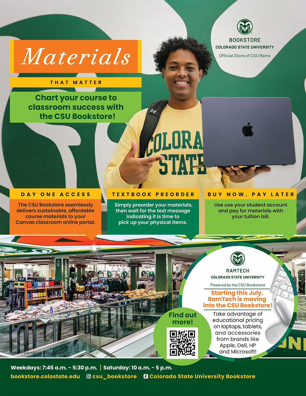
Visual Solution
The new ads feature a photograph of a CSU student, wearing a yellow CSU sweatshirt, with a backpack slung over his shoulder. The student is positioned on the CSU Bookstore’s distinctive glass staircase, which visually connects the textbook level with the merchandise level and includes bold a CSU Ram graphic in the background. While the text does not mention supplies such as clothing or backpacks, the selected props introduce those items.
The student is holding a laptop, reinforcing the focus on digital course materials while subtly reflecting the CSU Bookstore’s expanded role in providing technology to students through the RAMtech merger. Additional panoramic photography familiarizes new students with the store, which was recently renovated and is an attractive flagship space.
Typography and Messaging
Since the new layout relies on photography and hierarchy to set up the context, copy was sharpened to highlight key services. The headline, “Materials That Matter,” anchors the message, supported by three subheads listing Day One Access, Textbook Preorder, and Buy Now, Pay Later. Fonts and color choices align with current CSU brand standards and bring more energy to the layout. Including the store's social media accounts at the bottom of the ad provides parents and students resources for more information and another way to engage with the store.

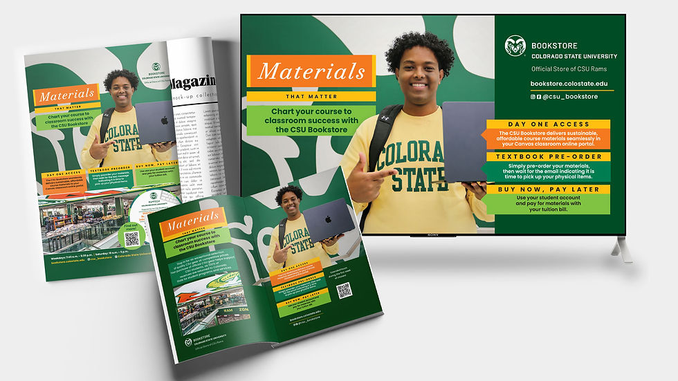
Extending the Design System
In addition to print ads, the visual system could be adapted across mediums. Options include digital LCD ads during orientation, custom shopping bags, matching coupons, a standing banner reinforcing the message in the space, and staff pins or shirts worn during peak back-to-school shopping periods. Each piece reinforces the same visual language and message, creating consistency across touchpoints.
Supporting Storytelling
To reinforce the visual campaign, I identified opportunities for longer-form storytelling that echoed the same themes of value and student support established in the ads. These pieces were intended to add depth and credibility by putting real people and real outcomes behind the visual message. Two stories were published through CSU’s SOURCE platform:
Crafting Solutions: CSU Bookstore Course Materials Guru Leverages Expertise for Students
A profile highlighting the human decision-making behind textbook selection and reinforcing the student-centered intent communicated in the campaign visuals. https://source.colostate.edu/crafting-solutions-csu-bookstore-course-materials-guru-leverages-expertise-for-students/
How the CSU Bookstore Saved Students Nearly $3 Million Last Year
A data-driven story demonstrating the tangible impact of strategic purchasing decisions and reinforcing the value message introduced in the advertising.
Results
After implementing the campaign:
Day One Access revenue exceeded $4 million in a single semester for the first time
CSU’s opt-out rate (2.5–3%) remained well below the national average of 6%
The combination of more effective advertising plus an intentional social media push allowed the CSU Bookstore to move up in the annual Rocky Mountain Student Media poll, transitioning from “Honorable Mention” to "Number 2 Best Bookstore" this year
Takeaway
This project demonstrates how design strategy can clarify complex services and support both student understanding and institutional goals. By pairing intentional visuals with clear messaging and authentic storytelling, the campaign reframed digital course materials as a supportive, student-centered resource.


Comments