
Welcome Campaign
Updated: Aug 31

For any new student, finding their way around a large campus can be daunting.
When CSU streamlined summer new student orientation from a two-day on-campus experience to a single-day program held primarily in the Lory Student Center, I identified an opportunity to make our buildng more approachable and unify previously unrelated student-facing collateral under one visual system. I created and pitched a full welcome campaign to leadership as a way to strengthen awareness of the Lory Student Center and introduce new students to building services early in their CSU experience.
Campaign Objectives
The campaign, “Step into the Center,” was designed to encourage students to visit the building and engage with its amenities, resources, and navigation points. The goal was to make a large and complex building feel approachable, easy to explore, and central to student life.
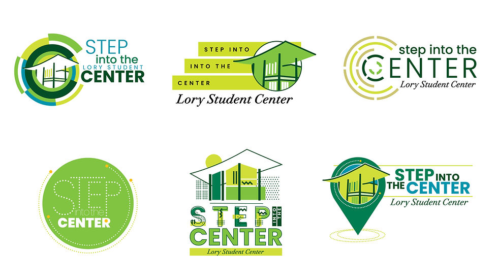
Creating the grounding mark was the first step in approaching the collateral. I developed circular logo ideas using CSU's "Find Your Energy" branded color palette and standard Poppins font. The direction chosen by LSC Leadership was a map pin graphic featuring a stylized roofline of the building enclosed within a circle. This application reinforced themes of navigation, discovery, and connection to campus. I used the partial circle dotted line in other collateral, so the mark coordinated with existing components. The dotted line was expanded to show sidewalk traffic across campus, integrating the directional motif.
Drone photography of the East entrance, which I commissioned earlier during peak Fall colors, was introduced for a realistic sense of place, while a graphic campus map representation supported the navigation concept. The overall effect reinforced accessibility to students and presented a complex facility with easy-to-navigate cues.

Once the visual system was created, it was applied across platforms to build a cohesive look.
Campaign Components
Early Print + Environmental Advertising
Advertisements designed and placed in the Parent and Family Guide, Ram Orientation Guide, and Move In Edition of the student paper, The Collegian.
Digital campaign graphics displayed on LCD screens across the building
Coordinated signage system developed for seven building poster kiosks stationed at key traffic points
This early messaging was critical for Orientation visits, as obtaining a RamCard, learning about course materials from the CSU Bookstore, and finding ways to engage with clubs and activities or find a campus job are basic steps for student success.

Welcome Kit
A branded onboarding package was created to help new community members navigate the breadth campus resources available within the LSC. Kit materials included:
A welcome folder featuring the campaign pin graphic and map
Matching envelope and sticker
Promotional coupons
Informational pamphlet with 40 office and venue listings, including social media handles
While a welcome kit for employees had become an annual marketing staple, the new design and format, featuring a mini-pocket folder, could be adapted for broader audiences and multiple purposes. The modular system could be customized to present future rack-card sized collateral on various offerings in the building.

Fall Welcome Festival Activation
To extend the campaign into in-person engagement, I designed an interactive tabling experience for Fall Welcome Week events.
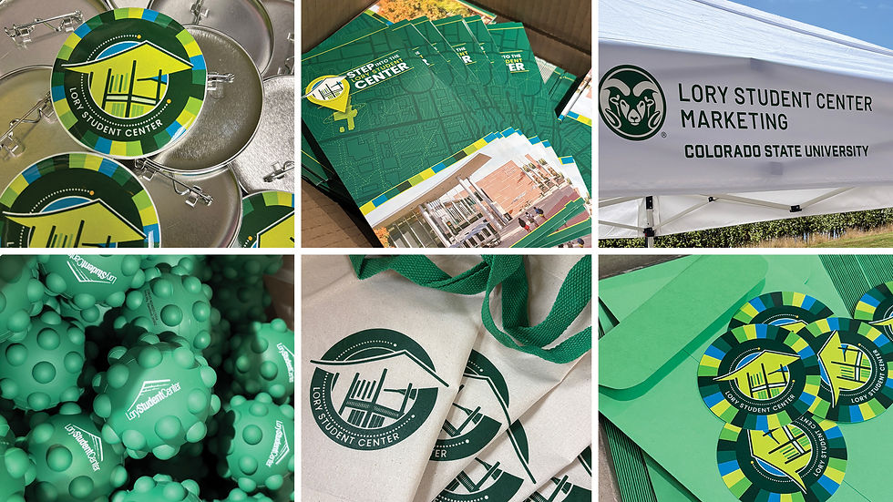

Elements included:
Customizable “Plinko” prize game with campaign header graphics featuring prize photography produced by a Marketing student
Campaign giveaways reflected the theme, including:
Aluminum pins
Stickers
A highlighter pack with LSC branding
Trendy green push-pop balls
Tote bags featuring an evergreen application of the theme artwork


Experiential Branding
To create visual consistency across events and spaces, I created:
Newly designed campaign-themed table runner
Branded pop-up tent for outdoor events
Existing branded logo tablecloth and step-and-repeat backdrop
Staff T-shirts featured oversized circular campaign artwork on the front, creating immediate connection to the building from a distance
Two standing banners incorporated pin and map graphics alongside department messaging

Social Media and Video elements
I also commissioned a video through CSU’s television channel, CTV. The video highlighted 15 things students could do at the Lory Student Center, including finding a job, joining a club, and grabbing coffee. It was shared on the day of the event, and stills from the video were repurposed as Instagram grid posts during the weeks leading up to launch.
Results
Across the campaign, the Instagram account reached approximately 70,000 views and nearly 10,000 individual accounts. The data showed a clear increase in followers, views, reach, and engagement around the time of the event.
Reviewing engagement trends by post also revealed which services students found most compelling. That insight created opportunities to further promote student clubs and venues that naturally resonated with the audience.

Strategic Goals
The campaign aimed to:
Increase awareness of Lory Student Center's services and resources as new students transition to campus
Create a unified and approachable path for students to access complex offices and services within a large higher education ecosystem
Establish a cohesive visual identity across print, digital, environmental, and experiential touchpoints
Unify advertising and events which previously reflected different themes for stronger message retention
By using a single graphic metaphor and slogan as a through-line from orientation to the first weeks of classes, the campaign brought consistency, familiarity, and cohesion to previously unrelated collateral while making building resources visible and accessible.


Comments